Accessibility Tools
PMG Digital Made for Humans
Typography 101: A Breakdown of the Basics
What is typography? I first heard this word in an intro design class in college. I initially thought, “What do trees have to do with design.” However, I soon figured out that my professor was not, in fact, discussing topography with us. Typography is the study of letter and word forms and how to visually arrange them. If you are not a designer, you will most likely never need to know about typography. However, if you find yourself in need of creative work, having a basic understanding of typography will help you communicate with your designer about what it is you are visually trying to achieve.
A typeface, also known as a font family, is a set of fonts. A typeface contains all of the different variations of a given font such as bold, light, italic, condensed, etc. A font is a specific variation of the font family, such as Helvetica Light.
Serifs are extensions at the ends of letter strokes. Serifs traditionally function as a means of a leading the eye from one letter to the next and thus create a more fluid reading process. Serif fonts are best associated with printed reading materials. Contrastingly, sans-serif fonts do not have serifs. An easy way to remember this is that “sans” means “without,” thus a sans-serif is without serifs. Sans-serifs are a more modern style and are often the go-to when designing for digital devices.
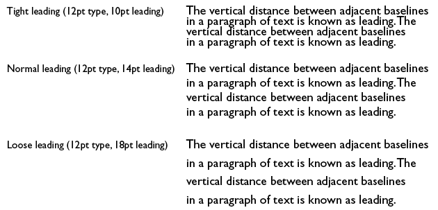
There are three terms used to describe spacing. The first is leading, which is used to describe the vertical spacing between lines. Increasing leading is often used to help improve legibility. Below, you can see an example of a few different leading options and how they affect your ability to read the text.

Stay in touch
Bringing news to you
Subscribe to our newsletter
By clicking and subscribing, you agree to our Terms of Service and Privacy Policy
The next term is tracking, which is the overall spacing between letters. Tight tracking can help to form unity within large scale text. Loose tracking can help improve legibility in small scale text by providing more “breathing room” between letters. Kerning is similar to tracking, but instead, it is the specific spacing between individual characters. Kerning is used to achieve a more precise letter spacing result. Below, you can see a comparison of the effects of tracking and kerning.This basic terminology guide will help give you a foundation in typography and help in understanding how to communicate with your designer about your typographic goals. If you’d like to explore a more in-depth overview of typography, this Smashing Magazine article is a great place to start!


